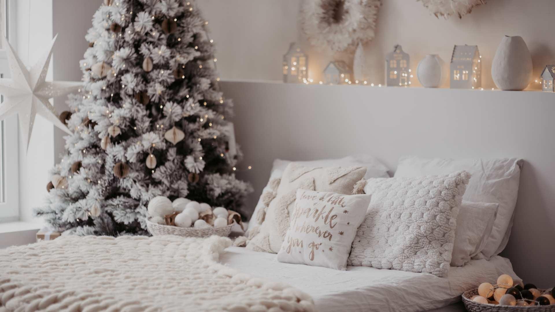
Winter Colors: Shades and Combinations for a Cozy Home

12/09/2023

Snow White:

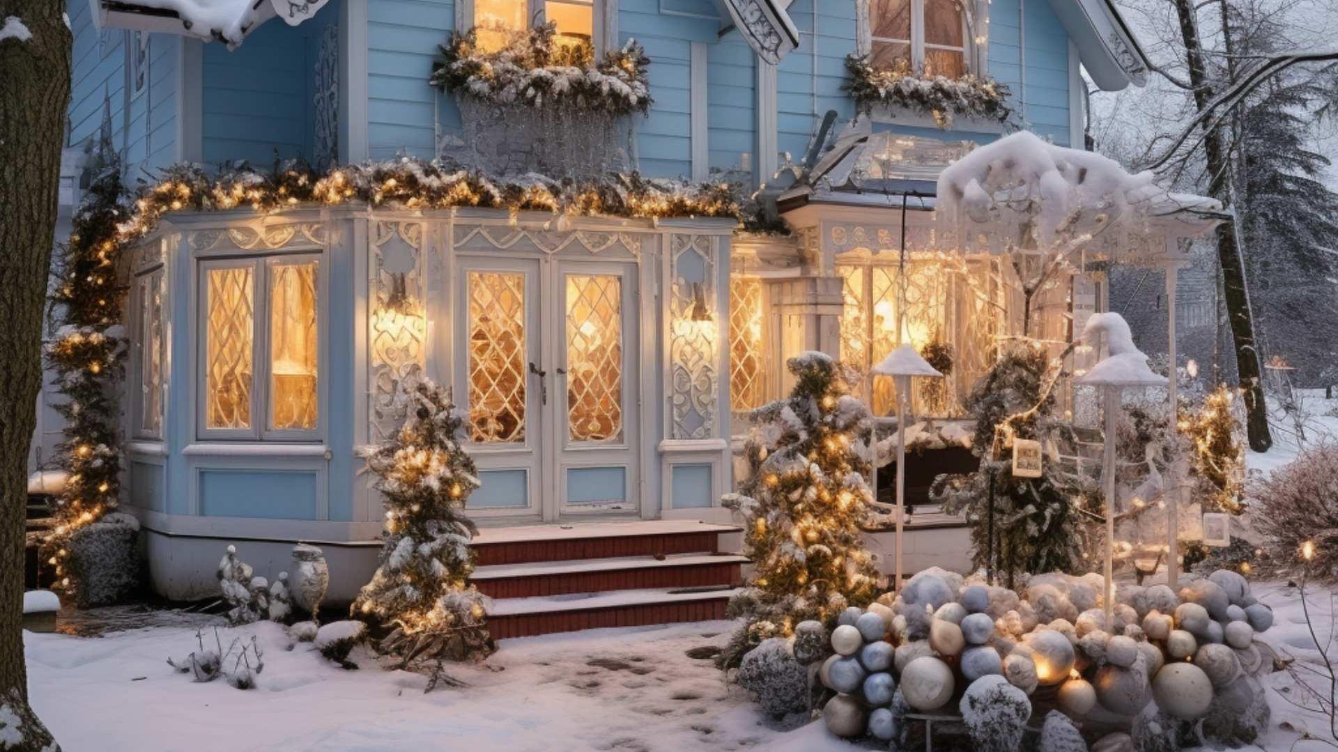
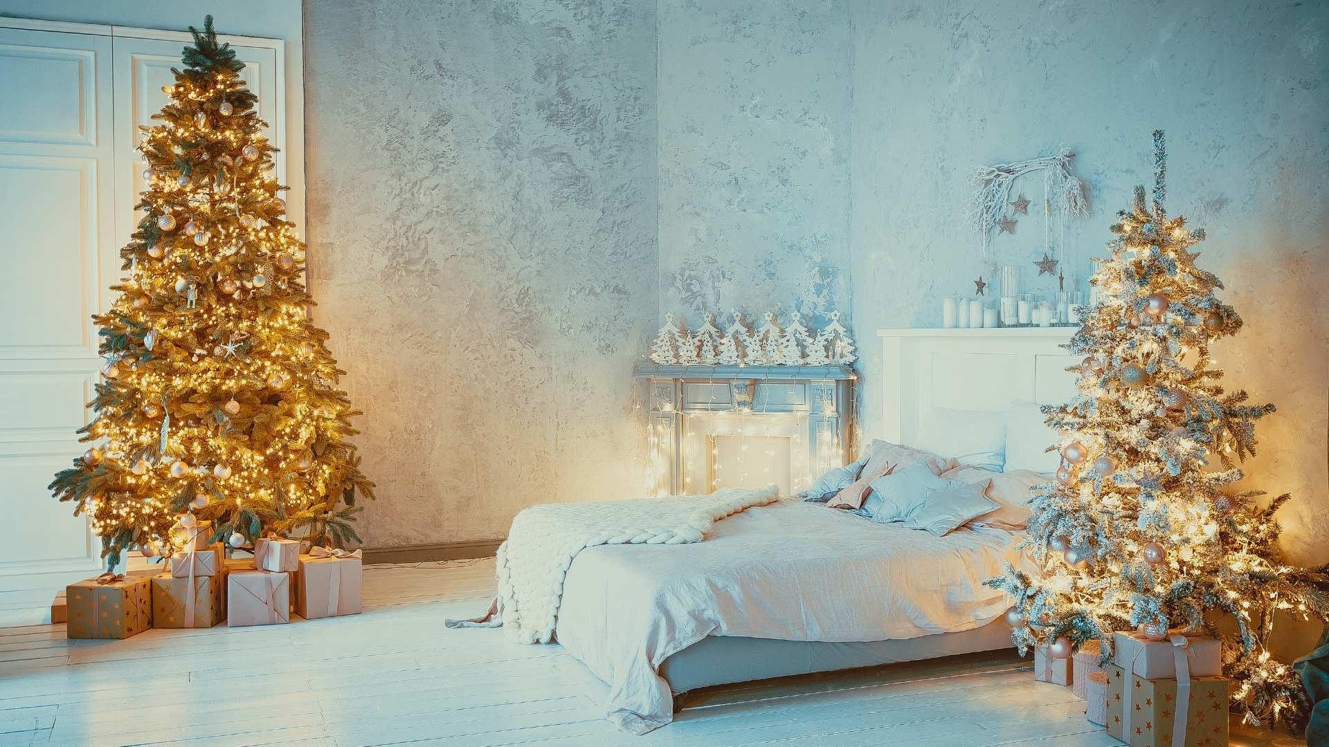
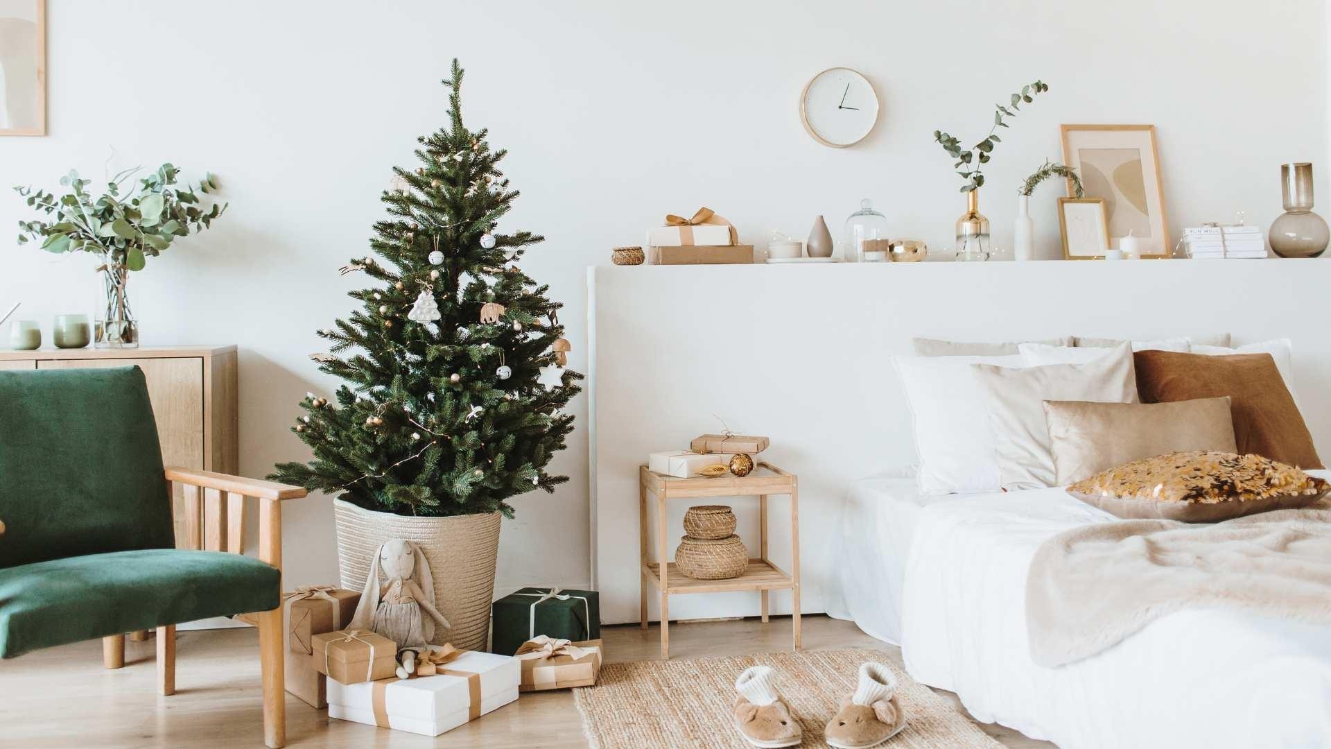
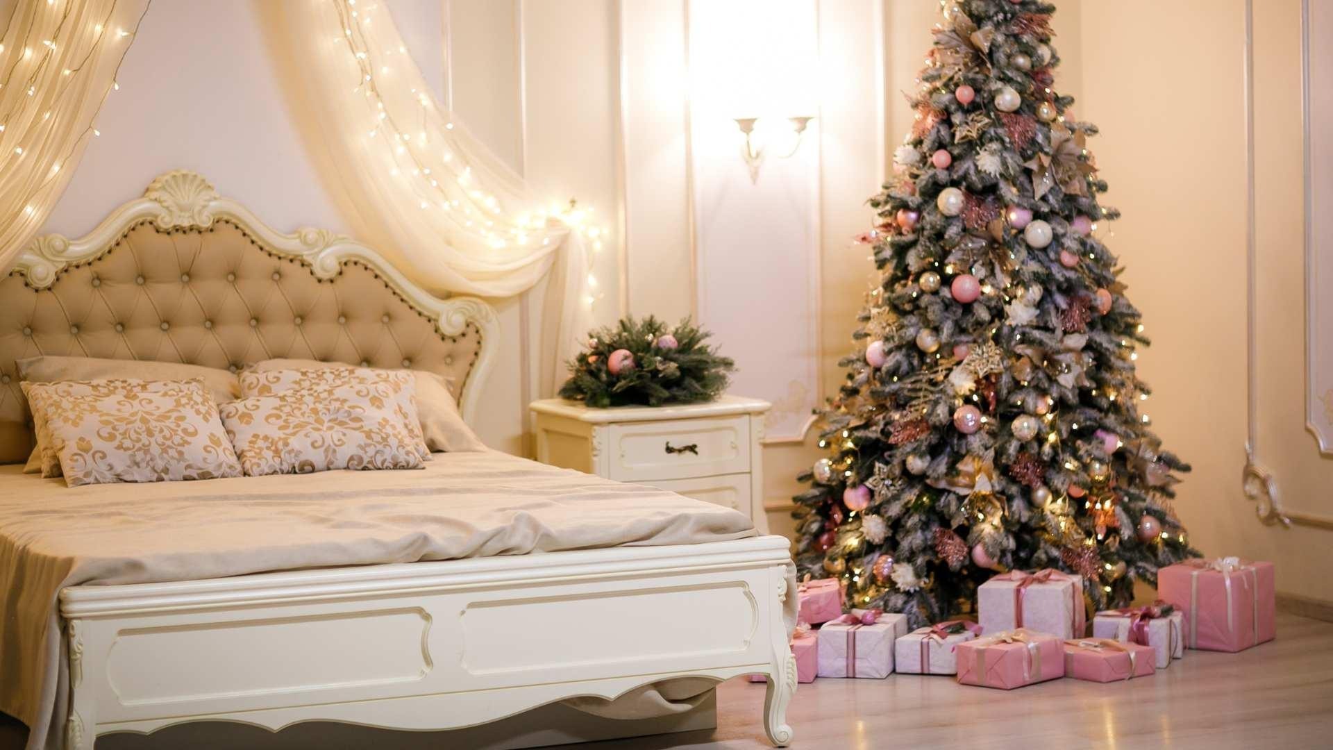
Start with a classic and timeless base: snow white. This bright and clean shade is perfect for creating a fresh and versatile backdrop. Use it on walls, furniture, and accessories to give your home a bright and airy look. Snow white pairs well with any other shade, allowing you to experiment with touches of color without compromising overall brightness.
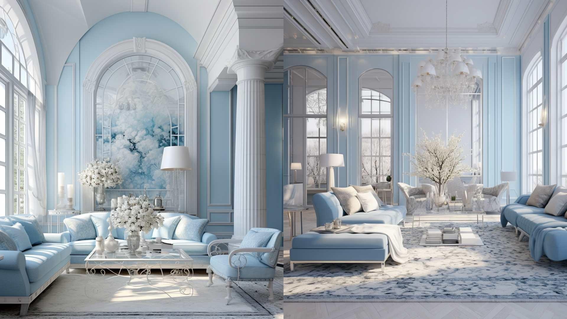

colori_interior_natale-IDW-Italia-Biella

colori_interior_natale-IDW-Italia-Biella


Ice Blue:

Ice blue is a refreshing and calming shade that evokes the winter atmosphere. Use it on walls or in fabrics like pillows and blankets to add a touch of freshness to your space. This shade pairs beautifully with snow white, creating an elegant and serene palette.


colori_interior_natale-IDW-Italia-Biella

colori_interior_natale-IDW-Italia-Biella

colori_interior_natale-IDW-Italia-Biella


Slate Gray:

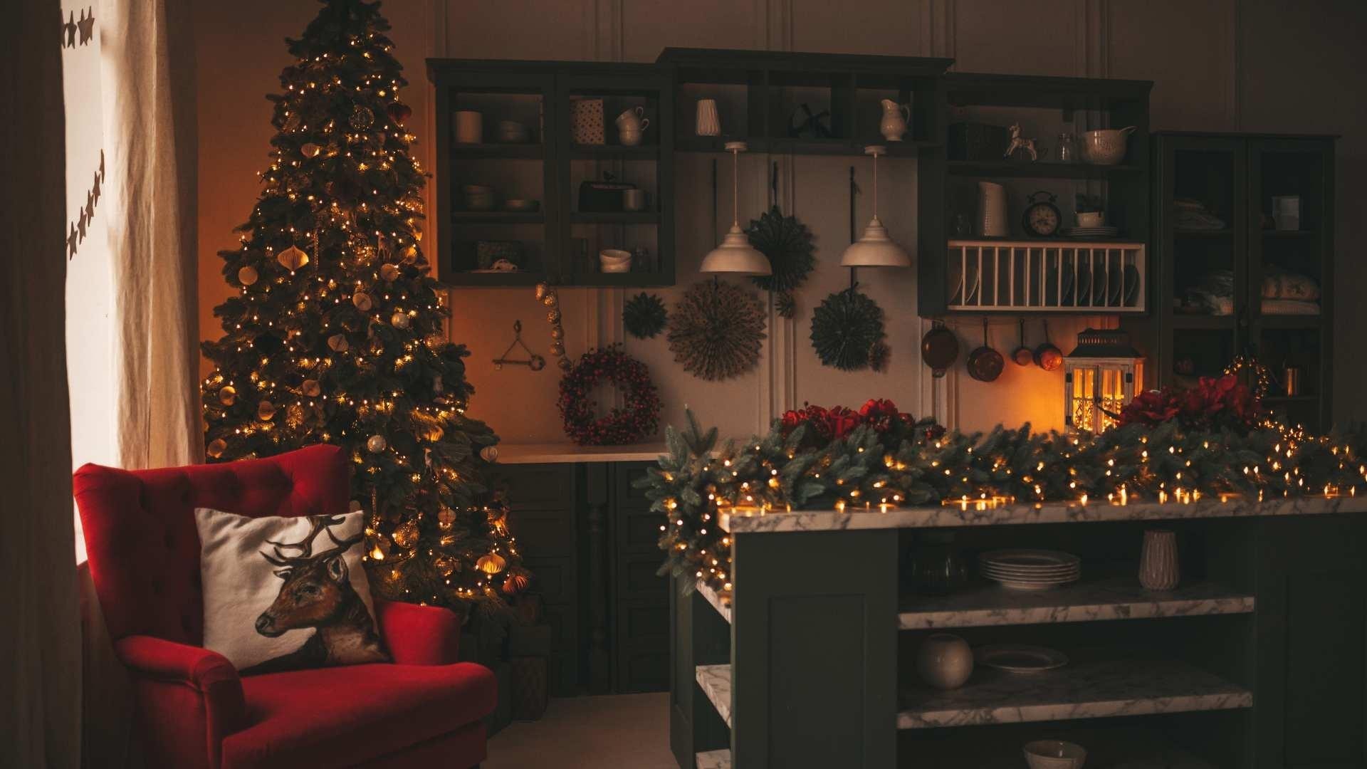
Slate gray is a sophisticated choice that adds depth and warmth to your home. Use this neutral shade on furniture, rugs, or as the main color for walls. Slate gray pairs well with warmer tones such as burgundy or chocolate brown, creating a cozy and rich environment.
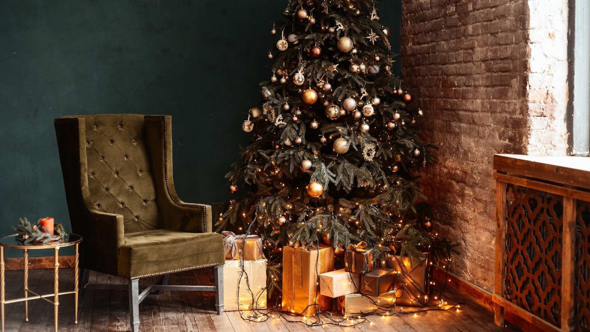
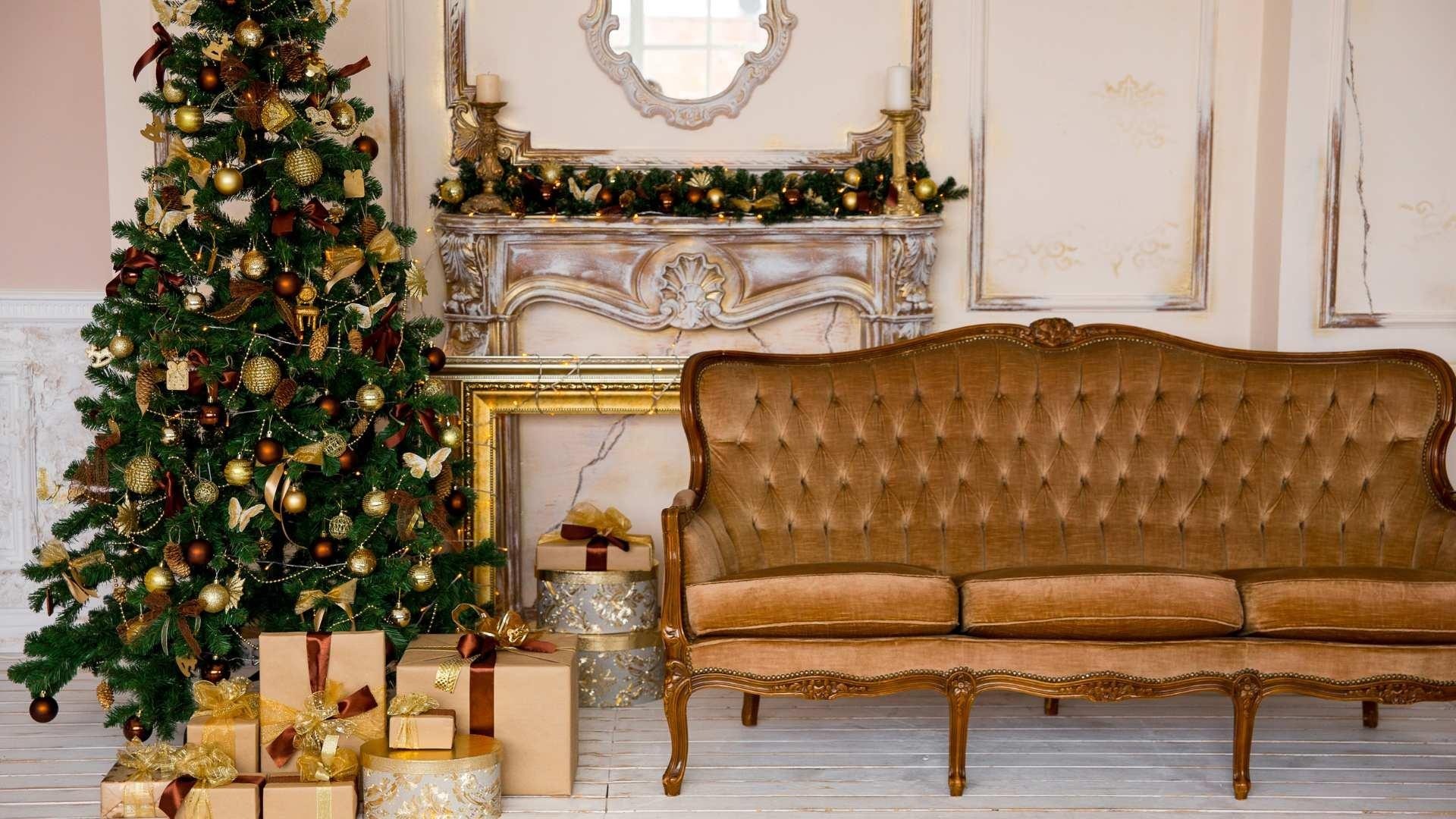

colori_interior_natale-IDW-Italia-Biella

colori_interior_natale-IDW-Italia-Biella

colori_interior_natale-IDW-Italia-Biella


Chocolate Brown:

Chocolate brown is a enveloping and welcoming shade that recalls the warmth of melted chocolate. Use it for furniture, curtains, or accessories to add an earthy note to your home. Chocolate brown pairs well with lighter shades such as beige or cream white, creating a balanced contrast.
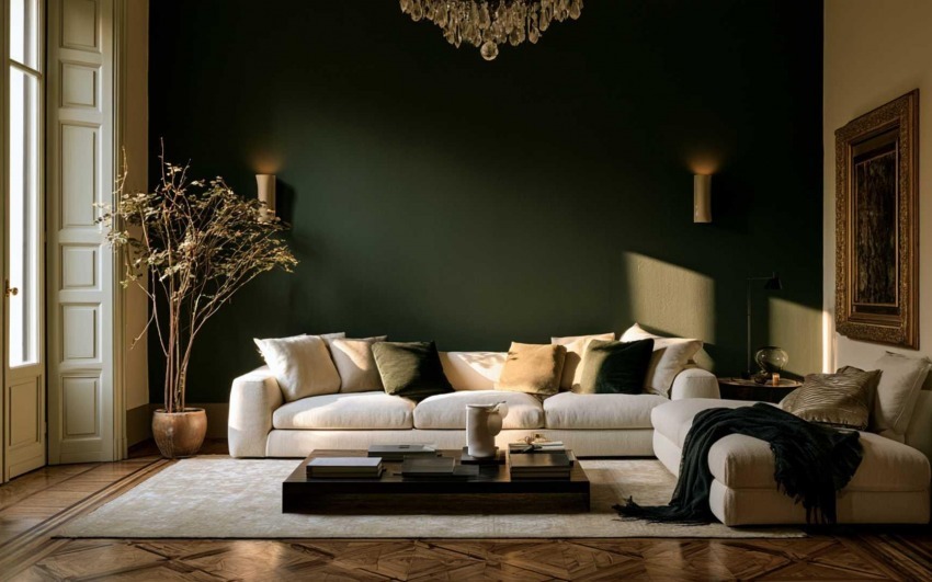
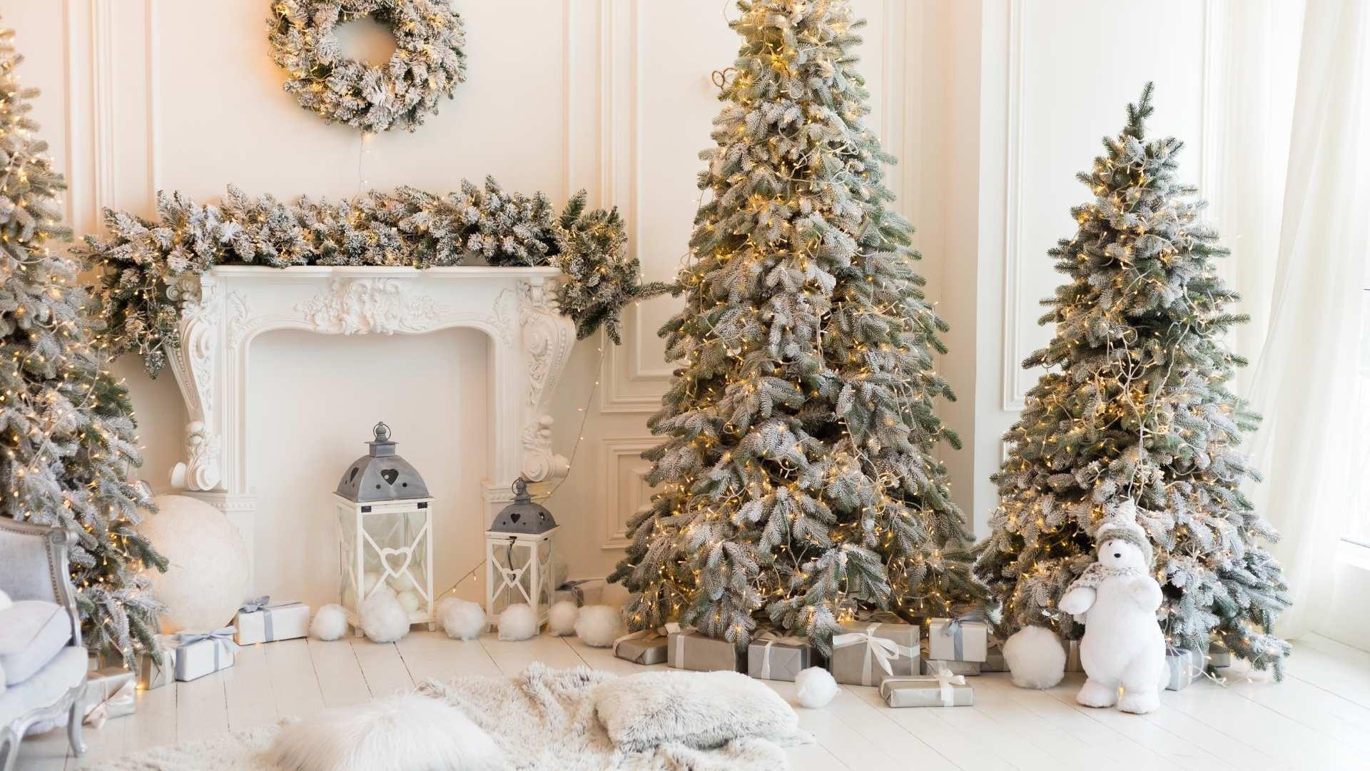
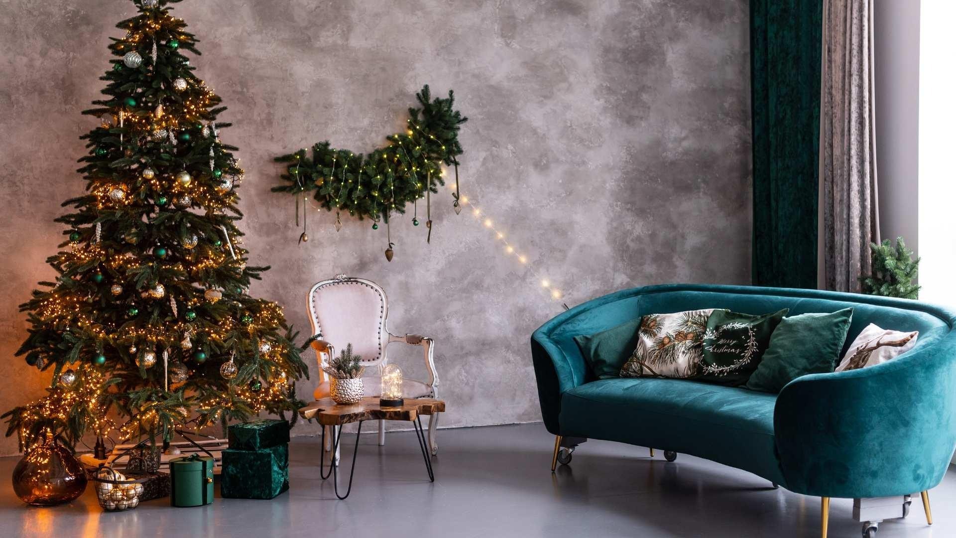
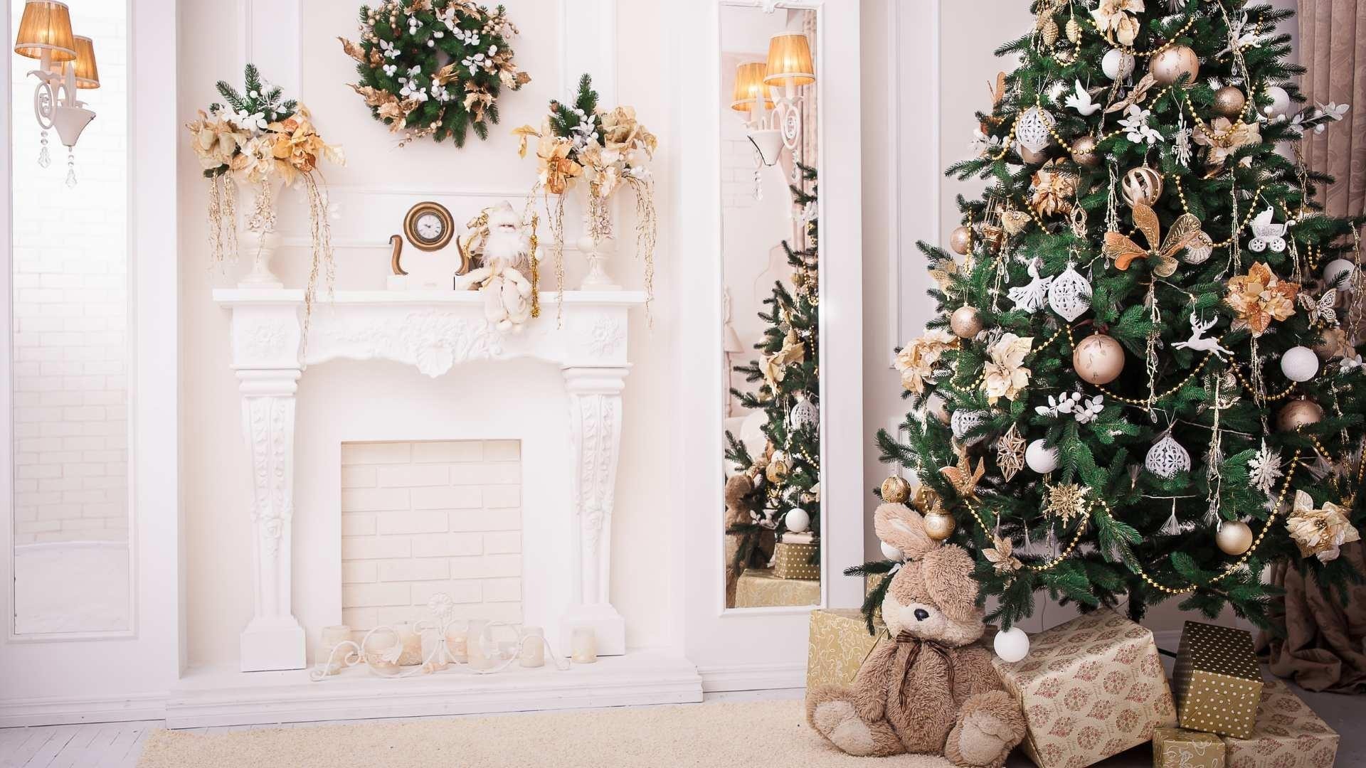

colori_interior_natale-IDW-Italia-Biella

colori_interior_natale-IDW-Italia-Biella


Pine Green:

Pine green is inspired by the beauty of Christmas trees and winter vegetation. Add this rich and refreshing shade to walls or decorations for a natural touch. Pine green pairs beautifully with red, creating a traditional and festive color combination.
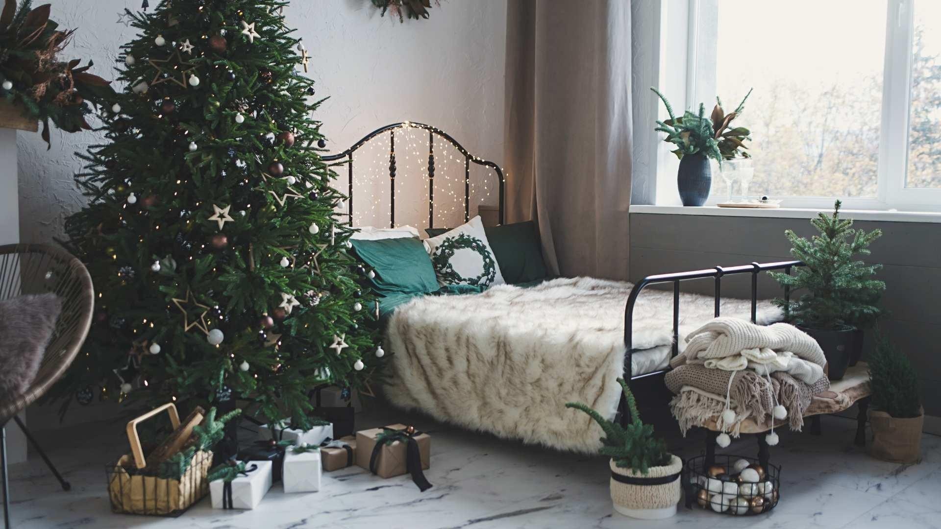
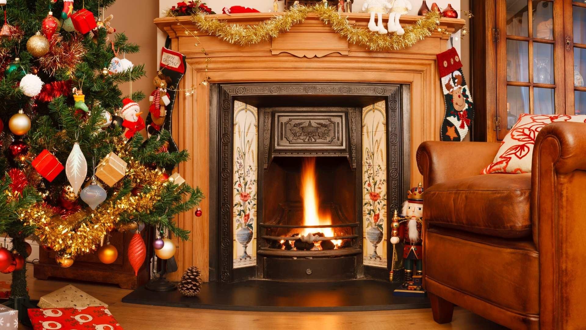
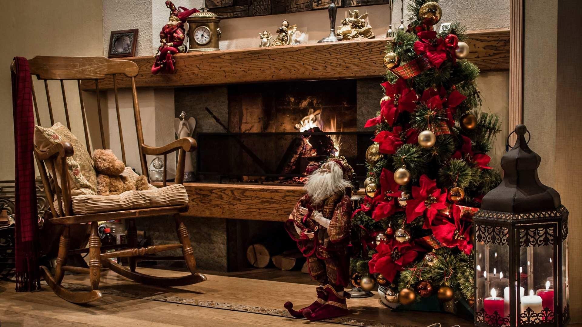

colori_interior_natale-IDW-Italia-Biella

colori_interior_natale-IDW-Italia-Biella


Bordeaux Red:

Bordeaux red is an intense and enveloping shade that adds a touch of luxury to your space. Use it on focal walls, sofas, or accessories to create a warm and welcoming atmosphere. Bordeaux red pairs well with neutral tones like gray or snow white, highlighting its intensity.


colori_interior_natale-IDW-Italia-Biella

colori_interior_natale-IDW-Italia-Biella


Antique Gold:

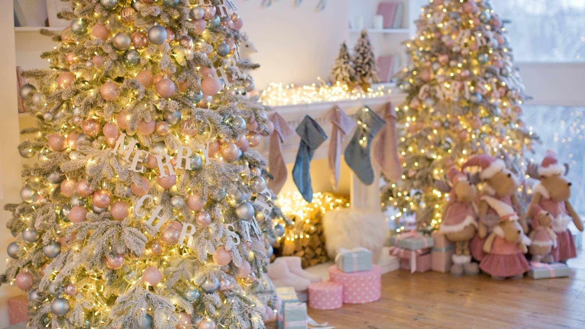
Add a touch of elegance with antique gold. Use it on frames, lamps, or decorative details for a luxurious winter style. Antique gold pairs well with shades like dark blue or forest green, creating a sophisticated color palette.


colori_interior_natale-IDW-Italia-Biella

colori_interior_natale-IDW-Italia-Biella

colori_interior_natale-IDW-Italia-Biella

colori_interior_natale-IDW-Italia-Biella


Experiment with these winter shades and their combinations to create a cozy and charming space. Remember that the strategic use of color can radically transform the atmosphere of your home, making it a welcoming retreat during the winter season.

Cristiano Castaldi IDW Italia
Cristiano Castaldi

Interior Designer since 1985

CEO & Founder, Italian Design in the World

Related Articles

  • Beautiful for Everyone: Accessibility, Age and Design That Doesn't Look
    4/10/2026 Beautiful for Everyone: Accessibility, Age and Design That Doesn't Look "Clinical"

    The prejudice comes from years of institutional rooms where function crushed aesthetics. In residential work, things have changed: handles that are objects, walk-in showers that are elegance before aid, wide doors and near-invisible thresholds that are build quality before regulation. The gap is not budget: it is awareness that dignity lives in daily details — the ones you touch hundreds of times a year.

  • Between One Room and Another: Vestibules, Corridors and the Rhythm of the Home
    4/03/2026 Between One Room and Another: Vestibules, Corridors and the Rhythm of the Home

    Open a catalogue of contemporary homes and you often find cover-worthy kitchens, theatrical bathrooms, living rooms that look like photo sets. Between one image and the next, a narrow corridor appears, lit by a sad single point — or a vestibule reduced to a knot between doors. That is not a technical detail: it is silent design about what life spends most of its time doing — passing through, pausing, shifting register, leaving one room before entering another.

  • A Room for Everything: Dedicated Spaces (Beyond Open Plan)
    3/27/2026 A Room for Everything: Dedicated Spaces (Beyond Open Plan)

    Open plan has dominated the image of the contemporary home: few walls, few boundaries, maximum flexibility. The promise was freedom — kitchen in dialogue with the living room, light flowing, no "closed" rooms. Over time many have discovered the downside: noise travelling, no refuge, difficulty concentrating or switching off. The response isn't to go back to the closed-off house of the past, but to rethink the value of dedicated spaces: environments with a clear function that the body and mind learn to recognise.

  • The Sound of the House: Acoustics, Silence and Absorbing Materials
    3/13/2026 The Sound of the House: Acoustics, Silence and Absorbing Materials

    Interior design has long favoured sight: colours, shapes, surfaces. Only recently have we started to talk about touch and smell. Hearing, by contrast, remains the most neglected sense at the design stage — yet it's the one we can't switch off. We live in homes that boom, reverberate, carry voices and noise from one room to another. The result is stress, fatigue, difficulty concentrating and resting.

  • The House That Breathes: Seasonality and Natural Rhythms in Interiors
    3/06/2026 The House That Breathes: Seasonality and Natural Rhythms in Interiors

    For decades interior design has chased the idea of a "perfect", unchanging space: same colours, same lights, same layout twelve months a year. The home as a photo set always ready, but often distant from the cycles that govern our body and our mood.Today a different idea is returning: the house as an organism that responds to the seasons. Not an aesthetic whim, but a response to the need to align the environments we live in with natural rhythms — light, temperature, colour, vegetation — with measurable benefits for sleep, concentration and wellbeing.March, with the equinox and the awakening of spring, is the ideal time to rethink interiors in a seasonal key.

  • Honest Materials: The Aesthetics of Truth (and the End of “Fake Luxury”)
    2/27/2026 Honest Materials: The Aesthetics of Truth (and the End of “Fake Luxury”)

    For years, interior design has lived with a contradiction: an obsession with effect.
Marble-effect. Wood-effect. Metal-effect. Stone-effect.
A home that looks like something, rather than truly being something.